Friday, March 07, 2008

Imdikrafts Interiors is a company that deals with outsourcing projects for both architecture and interior solutions. The icon "i" represents two people, the customer and the representative.
http://www.wishboxindia.com

This is a logo designed for an undergarment company for men. One of my favorite logo.
http://www.wishboxindia.com

Sunday, February 10, 2008

A logo was created for a schools 25th annual function. The concept of the logo is a fantasy of being someone big and reaching the stars.
http://www.wishboxindia.com Created by: Khushbu Sanghi, Tuney John.

Saturday, May 05, 2007

I really like this stationery. It speaks of the name as well as the company.The The O in the visiting card is punched so that it is reflected on the opposite side.

Logo for a PR firm Qommunicate. The logo speaks for itself. Do comment and let me know what you guys think.

Stationery.....
DIVA is my baby. One project which is really close to my heart. A store for complete ethnic wear for woman. So the rest is your imagination.
An iron and steel industry in Singapore. Straight to the point. Something that might create an instant likeness.
A simple logo designed for an in-house 24/7 coffee shop in a 4 star hotel 'Checkers'. The entire idea was to bring about the coffee feel in the most minimalist way.
This logo is for a Shirt brand, Cottonnaturals. The entire logo feel was to bring in an Indian motif and yet create a C as a short form for the name. A semi-formal shirt brand for men. This can also be used as an icon on shirts to create it's identity.

Friday, October 13, 2006

Hi people sorry for the long break! Well this is the fastest logo I have worked on. I completed this logo for a company called Digital Nirvana, that does reports on ads, so they came up with the name Ad wise for the reports to submit to their international clients. Do let me what do you guys think.

Sunday, July 09, 2006


This is another one of my logo done for a juice shop (Fictional). I wanted the logo to be fun and yet, attention grabber. Not much of detailing is given, keeping the rules of logo designing in mind.

Sunday, July 02, 2006


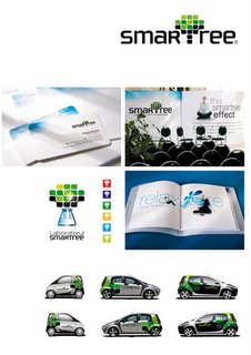
SMAT TREE "Smart logo" This is an IT company. Kickass logo... Nothing more to say... SUPERB. This logo has also won an award. Great work.

Can I get more inspired by this logo? The answer is Yes. Brilliant. I just loved it. Its a logo for a company that imports torchlights. Great work. This logo has also won an award. I just loved the colour and the effect thats been brought out. This definetly inspires me to create a simillar logo

Saturday, July 01, 2006

This is a computer system brand called Froggy. It won an award for it's great packaging and logo. I just loved the logo, it serves both the purpose of representing the name and what the company does . Brilliant design.

This is a logo for a fresh juice drink, where it's a mixture of two different fruits. Its fictional and no such logo exist, but it's one of the works i did and comments would be appreciated.

This Logo has been done for an Interior and Architecture firm called Two Tone. The logo is very simple and easily understood. The font used is Verdana. The entire logo is the obvious house like shape with two colours presenting the name. The stationary has a dye-cut where the yellowish orange blocks are cut so that any background can represent the second tone against blue.